

The saying “values do all the work but color gets all the credit” is commonly known to painters and photographers alike. One has only to look at Ansel Adams to grasp the concept that we only need a spectrum from light to dark to evoke a feeling of both form and drama. Or, to to demonstrate more clearly, observe how little changes in the feeling for the three-dimensional form when the color is stripped from one of my paintings:
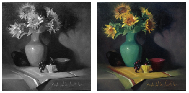
Value studies (observing the range and contrast of light and dark) are indispensable. They not only bifurcate the complications of painting, but are also beautifully direct. I often begin lessons with new students with a simple value study to asses where they are in their education and observe how they see subtle differentiations and contrasts. Values tell all.
Turning life into black and white isn’t much of a stretch of the imagination. What about going the other way? Using a black and white photo as a reference to create a colorful painting sounded like a challenge worthy of an intentional practice session.
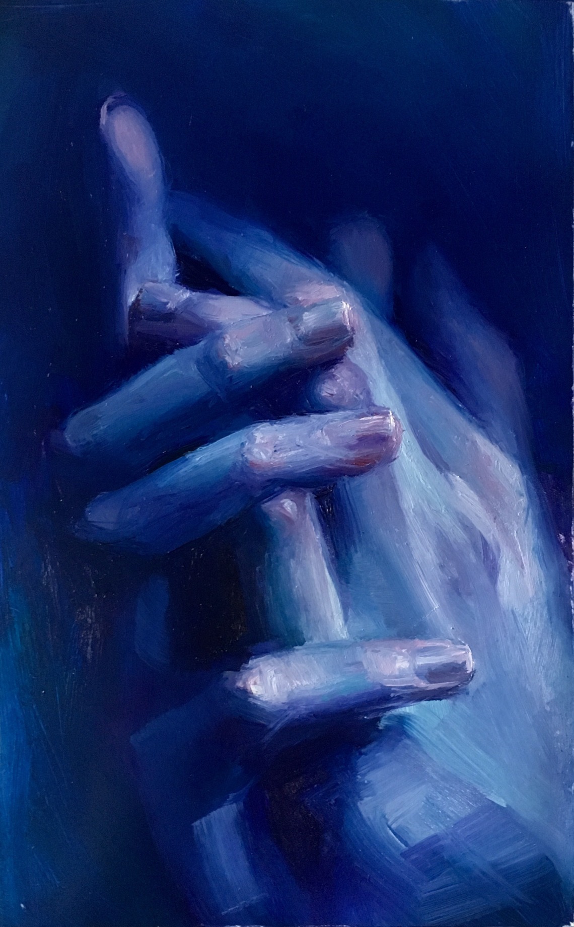
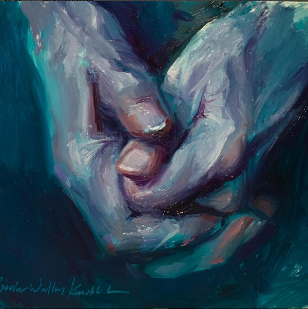
Next week I’ll be teaching a unit on hands, so this practice is helpful for me as well! Colors used: Alizarine, Dioxazine purple, Phthalo turquoise, Phthalo green, and titanium white.
To learn more about these paintings and/or to purchase original art, please contact me or follow the links in each painting’s caption.
